Overview:
Here is an application for the iPhone that’s way past its review due date. But hey, it’s never too late to review something from the pool of everything.
The Facebook application has been pretty prosperous when it comes to amount of downloads in the App Store and its interface is pretty interactive when it comes to a mobile media network. Of course, the application still has its restrictions, but I can tell you that it is a lot quicker and far more simple than the mobile browser version, and has all the same features. Plus I have almost been in a couple of car accidents because of the silly app. And yes, that is the application’s fault, not mine.
Review:
The application itself can be broken down into five tabs which are arranged at the bottom of the screen.
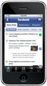
 Home Tab: Pretty self explanatory, but for what it is, this could probably be the most complicated tab. This tab itself can be broken into three tabs. The News Feed, Notifications, and Requests and each are self explanatory in their own right. On the News Feed tab there is a pretty nifty slide menu that can narrow what’s displayed on the feed. One annoying thing that doesn’t cause too many problems is in the notifications tab. It gives you updates on just about everything Facebook has to offer but when you touch an update from a friend, it will only take you to their Facebook and not what the update was about. Up in the top left corner there’s an icon where you can write your status and up in the top right corner is an icon to add pictures, take a new one, etc. That about caps it off for the home tab.
Profile Tab: The profile tab is also broken up into three tabs — Wall, Info, and Photos. I discovered a cool feature when using the Wall tab that I didn’t know about until just the other day. If you slide your finger across a post or an update it will give you the option to delete it from the wall. A lot more simple than having to go on the real website through the browser and deleting a comment you don’t want anyone to see and almost getting in an accident on your way home from work. It also has your picture and your status displayed just like your normal Facebook.
Friends Tab: The friends tab is simple with a list of your friends and their profile pictures next to them. It has a search bar on the top and an alphabetical search on the side for locating them quickly. You can then look at their profile, comment on their wall and pictures. All that good stuff.
Chat Tab: This tab is extremely useful because you can use it to talk to any of your friends. It shows online friends, friends that are idle, and friends that you’re in a conversation with. The chat is pretty standard, kind of like an aim box. It doesn’t always work, though, which is rather annoying.
Inbox Tab: And finally the inbox tab. It’s just your messages, which I hardly use. It has tabs for the Inbox, Sent and the Updates. Works just like the email, pretty standard.
Final Words: As for a mobile application, the Facebook Application works very well in supplement to the original Facebook. It only has a few kinks that show that it’s a mobile app, and that’s pretty impressive. The only big issue that I have is that I miss my good old computer screen and mouse interface sometimes.
Pros:
- Very versatile application
- Has everything you need to get you by without the browser version of Facebook
- Loading is pretty polished as well as the app itself
Cons:
- Sometimes you just miss the good ol’ computer
- Chat Tab doesn’t always work
- You can tell that your on a mobile app, and that’s no fun
Score: 9.0/10 (Amazing)
Display: 9/10 (Very pleasing to the eye and simple)
Interface: 9/10 (Not hard to use and no big issues)
Practicality: 9/10 (I haven’t gotten into an accident yet!)
 David Fincher has a real penchant for telling thoroughly engrossing stories. His filmography reads like a Dean’s List of phenomenal films, stuff ranging from the dark and moody Seven, to the super-charged and testosterone-filled Fight Club, and the cerebral and tension-filled Zodiac, Fincher has repeatedly told stories that feel like events.
 Home Tab: Pretty self explanatory, but for what it is, this could probably be the most complicated tab. This tab itself can be broken into three tabs. The News Feed, Notifications, and Requests and each are self explanatory in their own right. On the News Feed tab there is a pretty nifty slide menu that can narrow what’s displayed on the feed. One annoying thing that doesn’t cause too many problems is in the notifications tab. It gives you updates on just about everything Facebook has to offer but when you touch an update from a friend, it will only take you to their Facebook and not what the update was about. Up in the top left corner there’s an icon where you can write your status and up in the top right corner is an icon to add pictures, take a new one, etc. That about caps it off for the home tab.